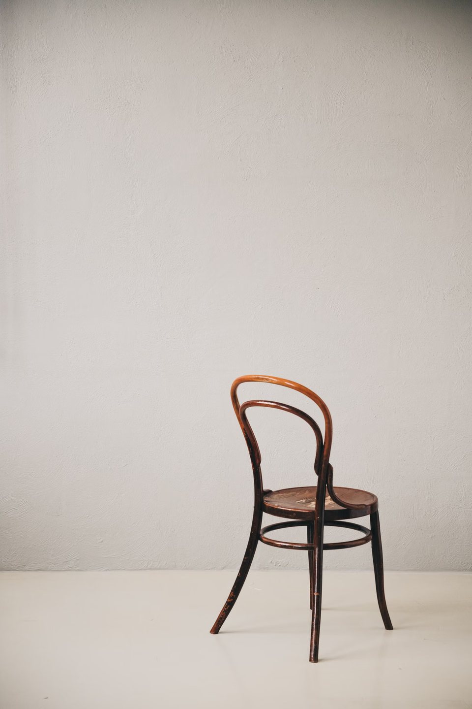
Scandinavian Chair
(Seating)
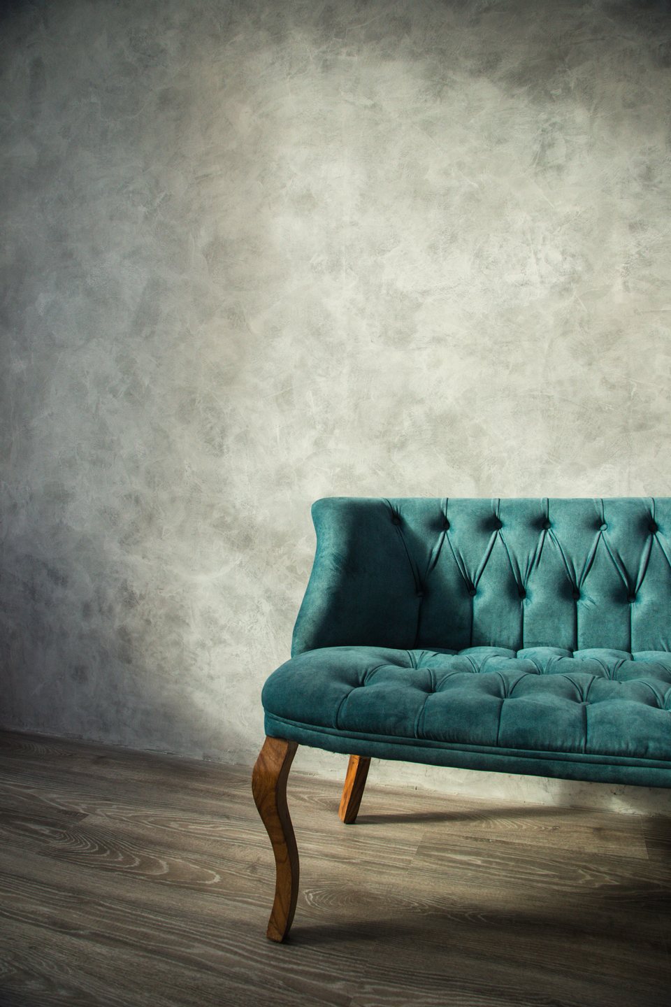
Elegant Sofa
(Living Room)
N
O
R
K
W
O
O
D
Scandinavian Chair
(Seating)
Elegant Sofa
(Living Room)
`. Both wrappers are masks. - The headline is split **manually**: each of the 8 letters is a `.letter` (the mask) containing a `.letter-wrapper` (the moving glyph). "NORK" = `.header-item-1`, "WOOD" = `.header-item-2`. - Use **"Nork Wood"** as the neutral placeholder furniture brand (nav logo). No real brand names. ## Styling Font: the design uses **"PP Neue Montreal"** (a clean neo-grotesque sans). It is not a free web font — declare `font-family: "PP Neue Montreal"` on `html, body` and let it fall back to a system sans-serif (`Helvetica, Arial, sans-serif`) if unavailable; the layout does not depend on the exact face. Weights used: **300** (the giant letters), **500** (nav links, captions), **bold** (logo). Palette: - Page background: `rgb(196, 196, 176)` — a muted sage / warm-beige olive. - All text: `#000`. Global: - `* { margin:0; padding:0; box-sizing:border-box }`. - `html, body { width:100%; height:100%; overflow:hidden }` (no scrolling — the whole thing fits one viewport). - `img { width:100%; height:100%; object-fit:cover }`. - `a { text-decoration:none; color:#000; font-size:13.5px; font-weight:500 }`. Nav: - `nav { position:fixed; top:0; width:100%; padding:1em; display:flex }`; `nav > div { flex:1 }` (three equal thirds). - `.logo a { font-weight:bold }`. `.nav-items { display:flex; gap:1em; justify-content:center }`. `.contact { display:flex; justify-content:flex-end }`. Container + grid: - `.container { display:flex; width:100vw; height:100vh; overflow:hidden }`. - `.items { width:100%; display:flex }`; `.items-col { flex:1; display:flex }`. - **Center column override:** `.items-col:nth-child(2) { flex:0 0 300px; display:flex; justify-content:center }` (fixed 300px-wide middle column, the two side columns share the rest). Side items: - `.item { position:relative; top:15vh; height:300px; flex:1; display:flex; flex-direction:column }` (pushed down 15vh from the top). - `.item-copy { padding:0.5em; height:50px; display:flex; flex-direction:column; justify-content:center }`. - `.item-copy-wrapper { clip-path: polygon(0 0, 100% 0, 100% 100%, 0% 100%) }` — a full-rect clip that acts as a **mask** for the caption `
`. - `.item-copy-wrapper p { position:relative; margin-bottom:0.25em; font-weight:500; font-size:13.5px; line-height:100% }`. - `.item-side .item-img { flex:1; overflow:hidden; clip-path: polygon(0 0, 100% 0, 100% 0, 0 0) }` — **initial** clip collapses the image to a zero-height sliver along its **top edge** (all four points at the top → invisible). Center hero: - `.item-main { position:relative; top:15vh; width:300px; height:450px; overflow:hidden }`. - `.item-main .item-img { overflow:hidden }`. - `.item-main .item-img img { transform: scale(0.5); clip-path: polygon(50% 50%, 50% 50%, 50% 50%, 50% 50%) }` — **initial** state: shrunk to half size AND clipped to a single collapsed center point (fully hidden). Headline: - `.header { position:absolute; bottom:35%; transform-origin:center center; width:100%; display:flex }` — **initial** `bottom:35%` (floating in the mid/lower screen). - `.header-item { position:relative; flex:1; display:flex; justify-content:center; transform: scale(0.25) }` — **initial** each word-mark is scaled to a quarter size. - `.header-item-1 { left: 18vw }` and `.header-item-2 { right: 18vw }` — **initial** the two words sit pulled inward toward center. - `.letter { flex:1; font-size:17vw; font-weight:300; display:flex; justify-content:center; align-items:center; clip-path: polygon(0 0, 100% 0, 100% 100%, 0% 100%) }` — huge glyphs; the full-rect clip masks the wrapper inside. - `.letter-wrapper { position:relative }` (this is what moves; JS parks it below the mask). ## GSAP effect (be exact) ### Pre-set (initial JS states, before the timeline) ```js gsap.set("nav", { y: -100 }); // nav parked 100px above the top edge gsap.set(".letter-wrapper", { y: 400 }); // every glyph shoved 400px down, hidden below its .letter mask gsap.set(".item-copy-wrapper p", { y: 50 }); // every caption line shoved 50px down, hidden below its mask ``` ### Defaults + timeline ```js gsap.defaults({ duration: 1, ease: "power3.out" }); // EVERY tween below is 1s, power3.out (none overrides it) const tl = gsap.timeline({ paused: true, delay: 0.5 }); // 0.5s delay, then... // ...build the chain below... tl.play(); ``` Position params: a bare `.to()` appends at the **end of the current timeline**; `"<"` aligns to the **start of the previous tween**. There are three functional phases. ### Phase A — headline letters rise (starts at t=0) ```js tl.to(".letter-wrapper", { y: 0, stagger: 0.1 }); ``` All **8** `.letter-wrapper` glyphs slide from `y:400` back to `y:0` — each rises up out of its `.letter` mask. Stagger `0.1` left-to-right, so "N-O-R-K-W-O-O-D" pop up one after another. Duration 1 each → last glyph starts at 0.7s, this phase ends ~**t=1.7**. ### Phase B — words nudge apart + center image un-clips (appended, starts at t≈1.7) ```js tl.to(".header-item-1", { left: "12vw" }) // NORK: left 18vw → 12vw (drifts left) .to(".header-item-2", { right: "8vw" }, "<") // WOOD: right 18vw → 8vw (drifts right) — same start .to(".item-main .item-img img", // center hero image... { clipPath: "polygon(0% 100%, 100% 100%, 100% 0%, 0% 0%)" }, "<"); // ...clip opens center-point → full rect ``` The two word-marks begin spreading outward while the center product image blooms open from its collapsed center point to a full rectangle (still at `scale(0.5)`). All three tweens share the same start (`"<"`), duration 1 → ends ~**t=2.7**. ### Phase C — the big finish (all appended at the SAME start, t≈2.7) All seven tweens below use `"<"` to align to the **start of the first Phase-C tween**, so they run in parallel from ~t=2.7: ```js tl.to(".header-item-1", { left: 0, scale: 1 }) // NORK slams to left edge + scales 0.25 → 1 .to(".header-item-2", { right: 0, scale: 1 }, "<") // WOOD slams to right edge + scales 0.25 → 1 .to(".item-main .item-img img", { scale: 1 }, "<") // center hero image scales 0.5 → 1 .to(".item-side .item-img", // the 6 side thumbnails... { clipPath: "polygon(0% 100%, 100% 100%, 100% 0%, 0% 0%)", stagger: 0.1 }, "<") // ...wipe open top→bottom, staggered .to(".header", { bottom: 0 }, "<") // whole headline block drops 35% → 0 (to bottom edge) .to(".item-copy-wrapper p", { y: 0, stagger: 0.05 }, "<") // all 14 caption lines rise out of their masks .to("nav", { y: 0 }, "<"); // nav drops in from -100 → 0 ``` Clip-path notes: - The **side images** start clipped to their top edge (`polygon(0 0, 100% 0, 100% 0, 0 0)`) and animate to the full rect `polygon(0% 100%, 100% 100%, 100% 0%, 0% 0%)` — the top two points stay put, the bottom two travel down from the top, so each thumbnail **wipes open downward** from the top. Stagger `0.1` across the 6 → they cascade. - The **caption lines**: 14 `
` (2 per product × 7) slide `y:50 → 0`, stagger `0.05`. - All clip-path polygons have matching 4-point counts so GSAP interpolates them smoothly. ### Timeline summary (seconds, relative to timeline start; add the 0.5s delay for wall-clock) | t (s) | what happens | |------|--------------| | 0 – 1.7 | 8 headline letters rise `y:400→0` out of masks, stagger 0.1 | | 1.7 – 2.7 | NORK `left 18→12vw`, WOOD `right 18→8vw`, center image clip center-point → full rect | | 2.7 – 3.7 | NORK `left→0 scale→1`, WOOD `right→0 scale→1`, center image `scale 0.5→1`, headline block `bottom 35%→0`, nav `y:-100→0` | | 2.7 – 4.2 | 6 side thumbnails clip open top→bottom, stagger 0.1 | | 2.7 – 4.35 | 14 caption lines `y:50→0`, stagger 0.05 | Total runtime ≈ **4.85s** including the 0.5s delay. Every tween is `duration:1, ease:"power3.out"` (the global default — nothing overrides it). ## Assets / images **7 product photographs** of minimalist furniture / home objects, each shot on a plain neutral studio background (soft warm/grey seamless), matching the muted sage page. `object-fit: cover`. - **1 hero image** (center, `.item-main`, box ~300×450 → portrait ~2:3): an elegant upholstered sofa as the flagship product. - **6 thumbnails** (side columns, cover-cropped roughly square): a Scandinavian wooden chair, a minimal table/floor lamp, a modern wooden desk, a compact wooden shelving unit, an ornate decorative mirror, a sleek minimal dining table. All should read as a matched catalog set — clean, editorial, evenly lit, neutral backdrops. If exact subjects are unavailable, any set of well-lit minimalist furniture on neutral backgrounds works. ## Behavior notes - **Autoplay once** on `DOMContentLoaded` after a 0.5s delay. No scroll, hover, or click triggers; the page never scrolls (`overflow:hidden` on `html,body`). - The animation mixes CSS-property tweens (`left`/`right`/`bottom` in `vw`/`%`, `y` in px, `scale`, and `clipPath` polygons) — GSAP handles the unit interpolation; keep the initial CSS values exactly as specified since the tweens read from them. - **Responsive** (`@media max-width: 900px`): `.item-side { display:none }` (side thumbnails hidden, only the center hero shows); `.header { bottom:45% }`; `.header-item { transform: scale(0.5) }`; `.header-item-1 { left:14vw }`; `.header-item-2 { right:11vw }`. The timeline itself is unchanged — it still animates the (now hidden) side images harmlessly. - No reduced-motion handling in the original; the whole reveal is the point of the page.