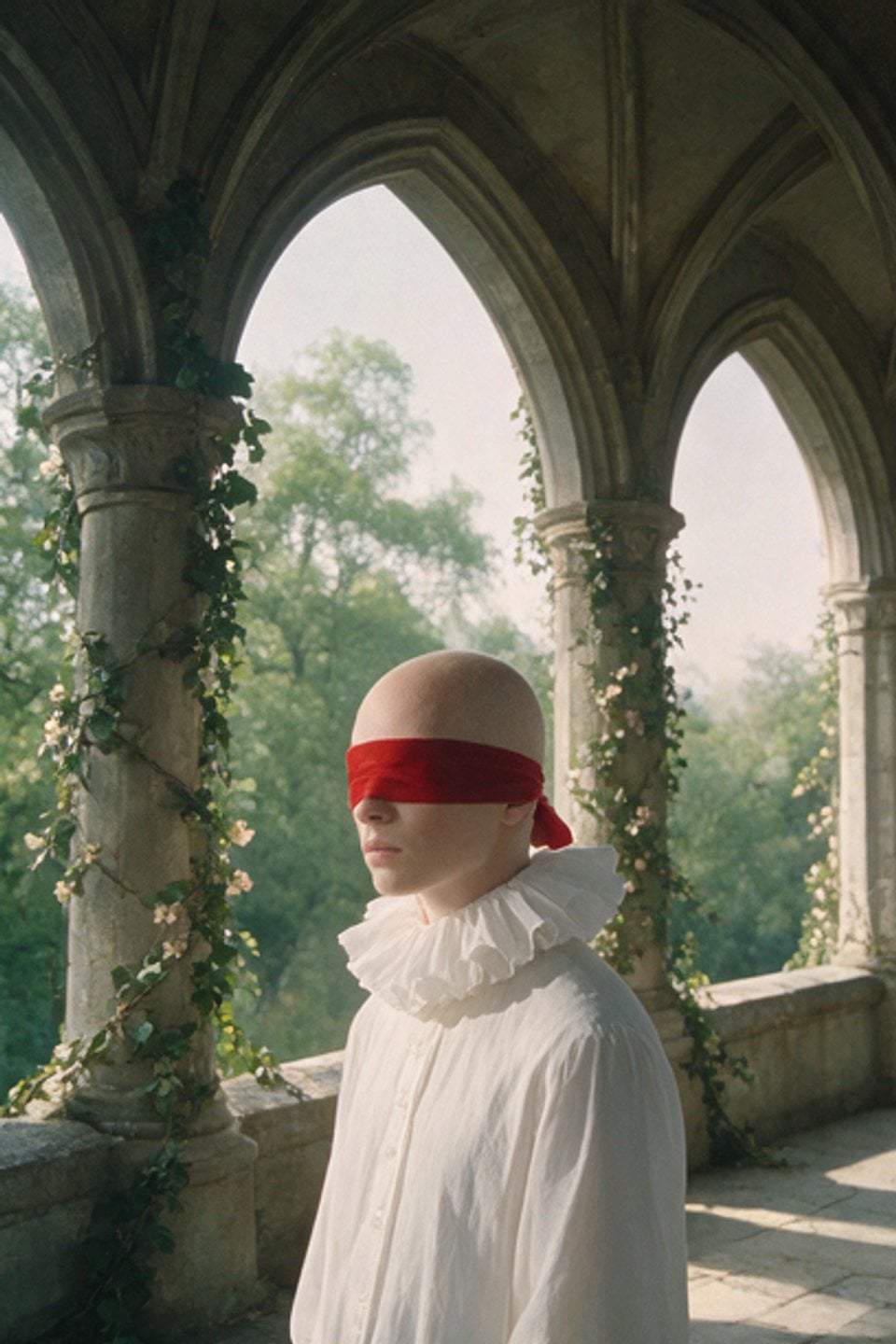
` each, pushed to the left/right edges. **Perspective viewport** — `.container { position:fixed; width:100%; height:100%; overflow:hidden; perspective:1500px; }`. The `perspective:1500px` on this parent is what makes the ring read as 3D depth (near tiles large, far tiles small). `overflow:hidden` clips the ring to the screen. **Ring wrapper** — `.gallery { position:absolute; top:19%; left:49%; transform-style:preserve-3d; transform:translateX(-50%) rotateX(55deg); }`. It is offset to roughly upper-center, and its base **55° X-tilt** is what lays the ring down into a shallow tilted disc/carousel rather than a flat wheel facing you. `preserve-3d` is required so the child tiles keep their own 3D positions. **Tiles** — `.item { position:absolute; top:50%; left:50%; transform:translate(-50%,-50%); width:45px; height:60px; background:#b0b0b0; margin:10px; transform-style:preserve-3d; }`. Every tile is a small **45×60px (3:4 portrait)** rectangle, all stacked on the gallery's center point; their individual 3D rotations (set by JS, below) are what fan them out into the ring. `#b0b0b0` is just the placeholder color before the image paints. `preserve-3d` on the tile too. **Images** — `img { width:100%; height:100%; object-fit:cover; }` (center-crop fill inside each tile). **Centered preview** — `.preview-img { position:fixed; top:50%; left:50%; transform:translate(-50%,-50%); width:300px; height:200px; overflow:hidden; z-index:0; }`. A **300×200px (3:2 landscape)** window dead-center, sitting *behind* the ring (`z-index:0`), showing one large image that swaps on hover. ## GSAP effect (be exact — this is the whole component) Wrap everything in `window.onload = function () { … }`. Grab `const gallery = document.querySelector(".gallery")` and `const previewImage = document.querySelector(".preview-img img")`. ### 1. Generate the 150 tiles ```js for (let i = 0; i < 150; i++) { const item = document.createElement("div"); item.className = "item"; const img = document.createElement("img"); img.src = "/c/3d-circular-img-gallery/img" + ((i % 15) + 1) + ".jpg"; // cycle 15 sources item.appendChild(img); gallery.appendChild(item); } const items = document.querySelectorAll(".item"); const numberOfItems = items.length; // 150 const angleIncrement = 360 / numberOfItems; // = 2.4° between neighbours ``` So there are **150 tiles cycling through 15 source images** (`img1`..`img15`, then repeat), giving a densely packed ring. ### 2. Lay the tiles out into the ring (the geometry — critical) For each tile, `gsap.set` a fixed base pose: ```js items.forEach((item, index) => { gsap.set(item, { rotationY: 90, // turn the tile's plane so its face points along the ring rotationZ: index * angleIncrement - 90, // fan each tile to its own angle around the circle transformOrigin: "50% 400px", // pivot 400px BELOW the tile's center → this offset IS the ring radius }); // …hover handlers, below }); ``` The three together are what build the ring: every tile shares the center point, but `transformOrigin: "50% 400px"` pushes its rotation pivot 400px down, and `rotationZ = index*2.4 − 90` sweeps that 400px-radius arm around a full 360° so the 150 tiles land evenly around a circle. `rotationY: 90` orients each tile edge-/face-on to the ring tangent. Because the parent `.gallery` also carries `rotateX(55deg)` and the container has `perspective:1500px`, the finished result is a tilted ring seen in perspective. **These are `gsap.set` (instant), not animated.** ### 3. Scroll → full 360° spin (scrubbed ScrollTrigger — the star) ```js ScrollTrigger.create({ trigger: "body", start: "top top", end: "bottom bottom", scrub: 2, // 2s smoothing catch-up (heavy, laggy spin) onRefresh: setupRotation, // setupRotation is an empty no-op function onUpdate: (self) => { const rotationProgress = self.progress * 360 * 1; // 0 → 360 across the whole page items.forEach((item, index) => { const currentAngle = index * angleIncrement - 90 + rotationProgress; // base angle + scroll offset gsap.to(item, { rotationZ: currentAngle, duration: 1, ease: "power3.out", overwrite: "auto", }); }); }, }); ``` Details that matter: - Trigger is the raw `body` from `top top` to `bottom bottom`; combined with the **1000vh body**, that's a very long scroll track for one revolution. - `scrub: 2` means the animation lags the scrollbar by ~2 seconds, so the ring keeps spinning to catch up after you stop — a floaty, inertial feel. - On every update it recomputes each tile's `rotationZ` as **its base angle (`index*2.4 − 90`) plus a scroll-driven offset that ramps 0 → 360°**, and tweens each tile there with `duration:1, ease:"power3.out"`, `overwrite:"auto"`. So scrolling from top to bottom rotates the entire ring exactly one full turn; the per-tile `gsap.to` (rather than a single tween on the gallery) is what gives the slightly trailing, per-item settle. - `onRefresh` points at `function setupRotation() {}` — an intentionally empty callback; keep it for parity. ### 4. Mousemove → parallax tilt of the whole ring A `document`-level `mousemove` listener tilts the entire gallery toward the cursor: ```js document.addEventListener("mousemove", function (event) { const centerX = window.innerWidth / 2; const centerY = window.innerHeight / 2; const percentX = (event.clientX - centerX) / centerX; // −1 … +1 const percentY = (event.clientY - centerY) / centerY; // −1 … +1 const rotateX = 55 + percentY * 2; // 53° … 57° (tiny nudge around the 55° base) const rotateY = percentX * 2; // −2° … +2° gsap.to(gallery, { duration: 1, ease: "power2.out", rotateX: rotateX, rotateY: rotateY, overwrite: "auto", }); }); ``` The amplitude is intentionally small (**±2°** on each axis around the 55° resting tilt), `duration:1, ease:"power2.out"`, `overwrite:"auto"` — a subtle, smoothed parallax lean of the whole ring, not a big move. ### 5. Hover a tile → push out + swap the centered preview Inside the same `items.forEach`, attach per-tile hover handlers: ```js item.addEventListener("mouseover", function () { const imgInsideItem = item.querySelector("img"); previewImage.src = imgInsideItem.src; // large preview shows this tile's image gsap.to(item, { x: 10, z: 10, y: 10, ease: "power2.out", duration: 0.5 }); }); item.addEventListener("mouseout", function () { previewImage.src = "/c/3d-circular-img-gallery/img1.jpg"; // reset preview to the default image gsap.to(item, { x: 0, y: 0, z: 0, ease: "power2.out", duration: 0.5 }); }); ``` On hover the tile is nudged **+10px on all three local axes (x, y, z)** — a small pop toward/out of the ring — with `ease:"power2.out", duration:0.5`, and the centered `.preview-img` swaps to that tile's picture. On mouse-out the tile eases back to `x/y/z: 0` and the preview reverts to `img1.jpg`. (Note: the original literally passes `x/y/z` in tile-local 3D space, so with `preserve-3d` the pop respects each tile's orientation.) ## Assets / images **15 source images** (`img1.jpg` … `img15.jpg`), cycled across the 150 tiles (tile *i* uses `img((i % 15) + 1)`), so each image repeats ~10 times around the ring. `img1` doubles as the **default centered preview**. The set is a cohesive but eclectic **cinematic / experimental / minimal editorial** mix — moody and high-contrast, roughly: - cinematic sci-fi / space scenes (a lone silhouette walking toward light between towering slabs; an astronaut before a giant pale sphere in golden haze; a space-helmet close-up with a molten-gold visor), - moody low-key **portraits** (wet hair across the face, a veil-draped figure, a blonde against a smoky backdrop, oversized futuristic visor sunglasses), - **surreal 3D renders** (a chrome robotic figure in a mosaic conical hat; a green-lit faceless render), - a couple of **still-life / scene** frames (red roses on black, a hazy sunset city skyline, a golden lucky-cat figurine in a red niche, a figure on a paddleboard at dusk). Source aspect ratios can be anything: **tiles center-crop to 3:4 portrait** (45×60px cells, `object-fit:cover`) and the **preview center-crops to 3:2 landscape** (300×200px). Because tiles render tiny, overall tone/contrast matters far more than resolution. Do **not** use real brand imagery or client logos — any set of ~15 moody, cinematic editorial images works. ## Behavior notes - **Desktop / pointer + scroll.** The three interactions are `mousemove` (ring tilt), scroll (ring spin), and per-tile hover (pop + preview). There is no click, no touch handling, and **no reduced-motion branch** — not mobile-safe as authored. - **Everything is smoothed, nothing snaps.** Scrub is `2` (laggy spin), the mouse tilt tweens over `duration:1`, and hover pops over `0.5` — the ring always eases into place after input stops. - **Perf is light.** ~150 small DOM tiles animated via GSAP; no WebGL/canvas. The scroll `onUpdate` issues 150 short `gsap.to`s per tick, but `overwrite:"auto"` keeps them from stacking. - Wrap in `window.onload` (not `DOMContentLoaded`) so images/layout exist before the ring is built and measured.